Healthy Mind
GOOGLE CERTIFICATE PROJECT
ROLE: UX Designer
SUMMARY: There’s a mental health crisis in the US right now, and globally as many people with mental health issues continue to struggle because they don’t know where to turn to or who to trust. Often, there are an overwhelming amount of resources that are in scattered locations, inaccessible to many communities. I designed an app and website for "Healthy Mind", which is a comprehensive list of mental health resources.
SUMMARY: There’s a mental health crisis in the US right now, and globally as many people with mental health issues continue to struggle because they don’t know where to turn to or who to trust. Often, there are an overwhelming amount of resources that are in scattered locations, inaccessible to many communities. I designed an app and website for "Healthy Mind", which is a comprehensive list of mental health resources.
USER RESEARCH:
My target audience are adults ages 18-65 of any gender. All people can benefit from mental health resources. From user research, most participants agreed that having a comprehensive place to have professionally recommended providers, media, and support groups is an easy way to access resources in a time of need when heavy research can be difficult to do. I learned from testing that users liked the easy navigation and readability when it came to reading the information provided. They liked how comprehensive the information is, but felt the categories were initially scattered.
USER PAIN POINTS
INITIAL DESIGN PHASE
Paper Wireframes: I started the design phase sketching a variety of layouts and finally landing one that I will turn into digital wireframes.
Digital Wireframes
I designed digital wireframes for multiple pages in Adobe XD. I wanted to the navigation to be simple and straightforward, and have information ready at the start of the page.
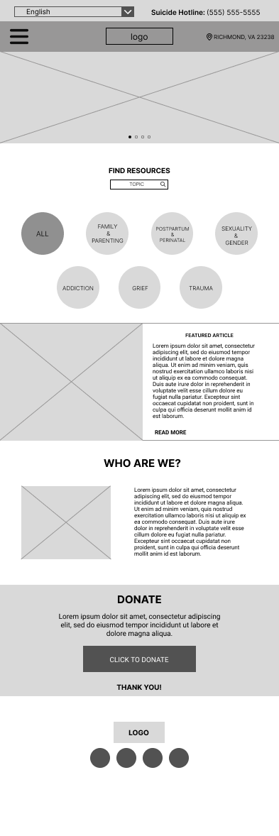
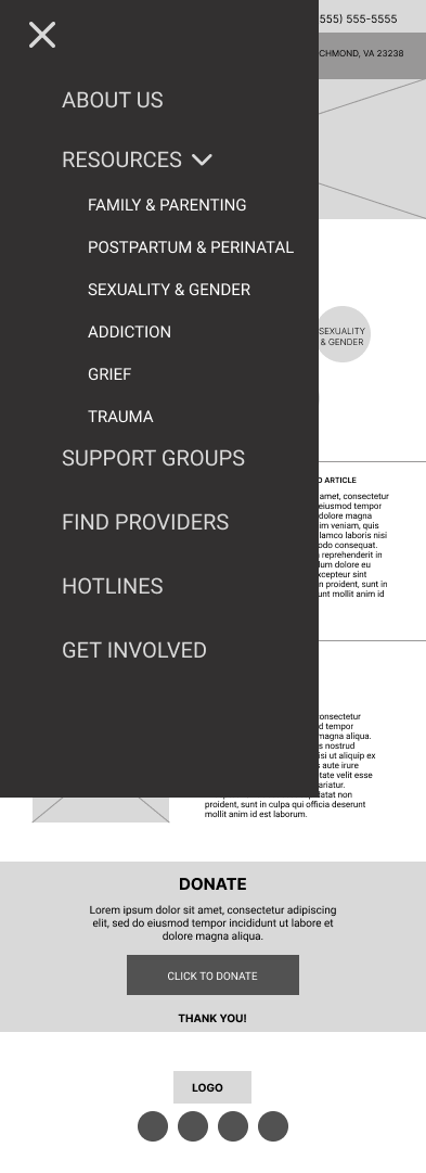

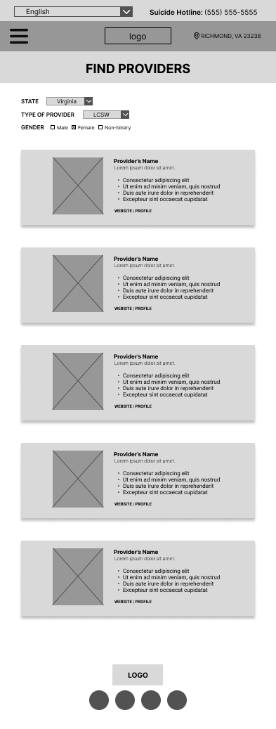
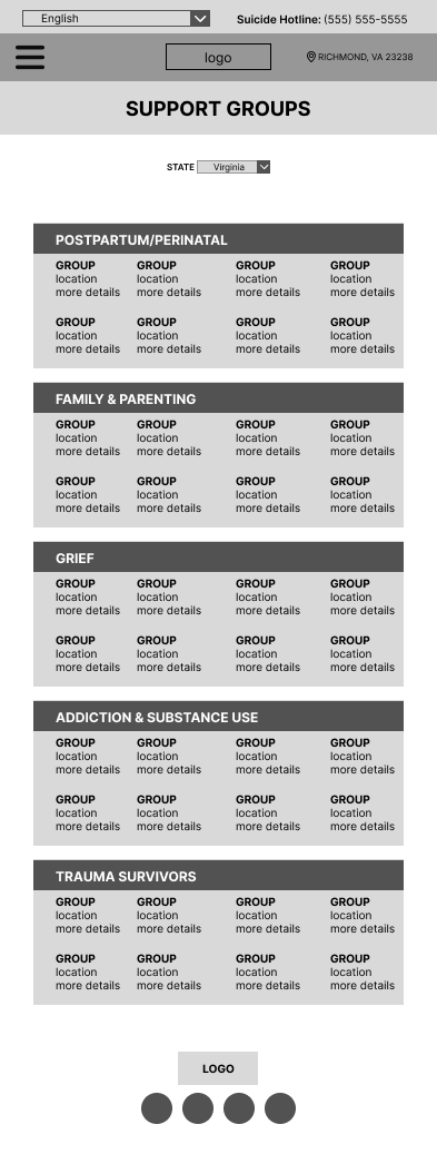
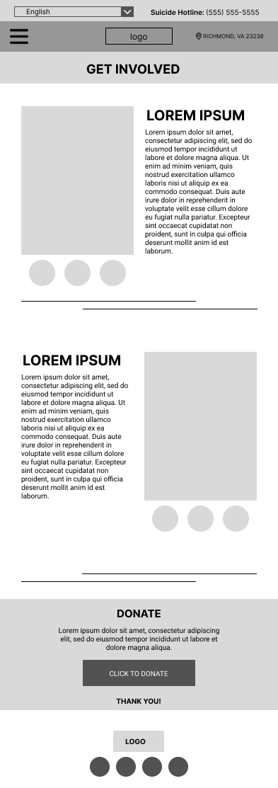
LOW-FIDELITY PROTOTYPE (MOBILE)
LOW-FIDELITY PROTOTYPE (DESKTOP)
USABILITY STUDY: FINDINGS
MOCKUPS
I chose purple as the main color because it is usually associated with mental health awareness. I went with serene, calming photos for the hero images to create a relaxed feel in the website.
DESKTOP MOCKUPS
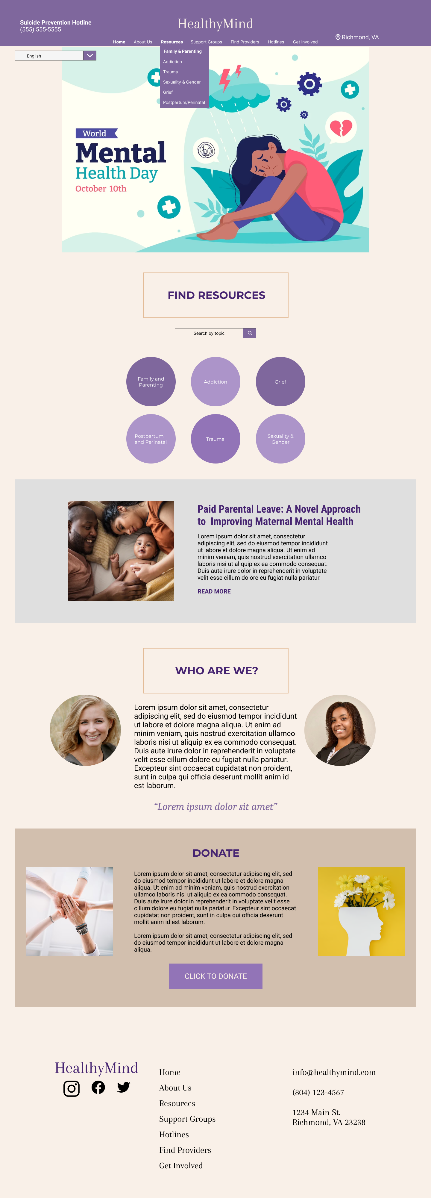

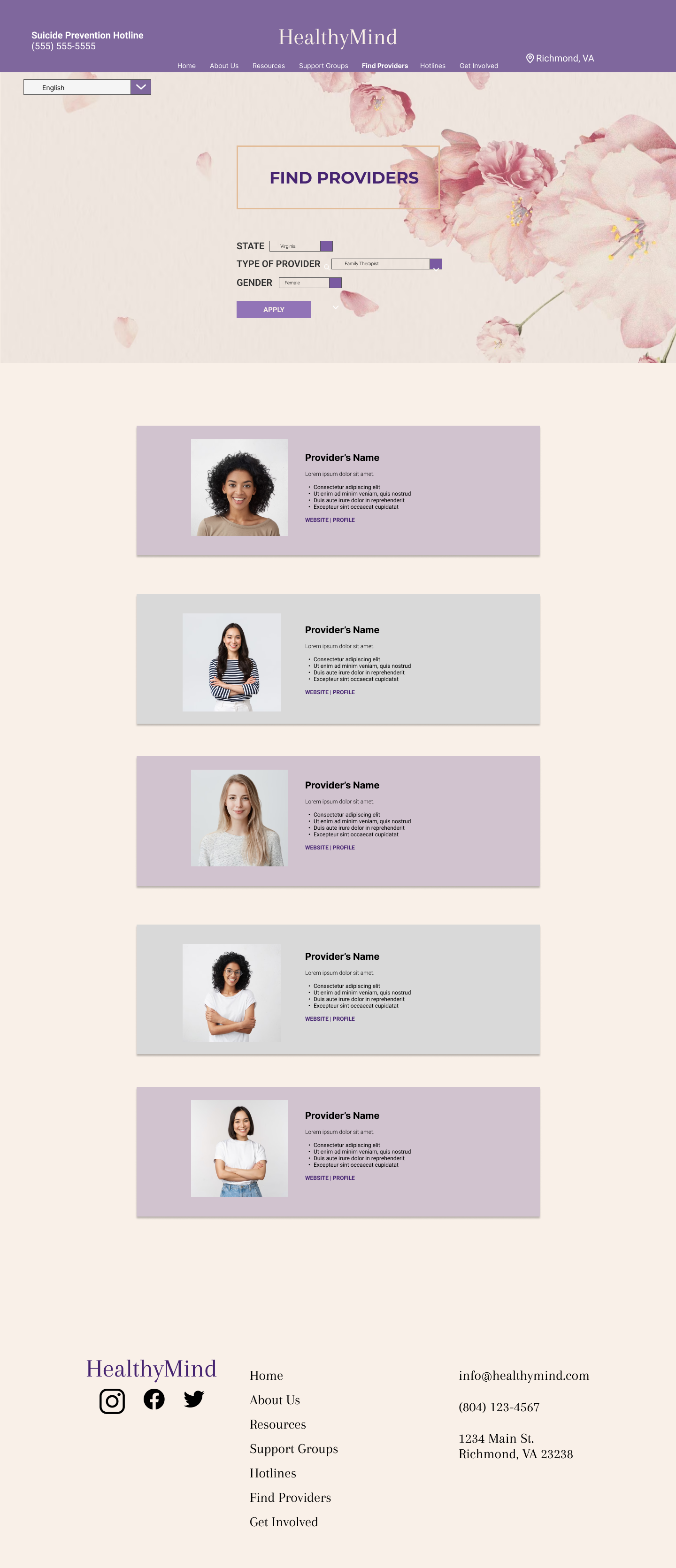
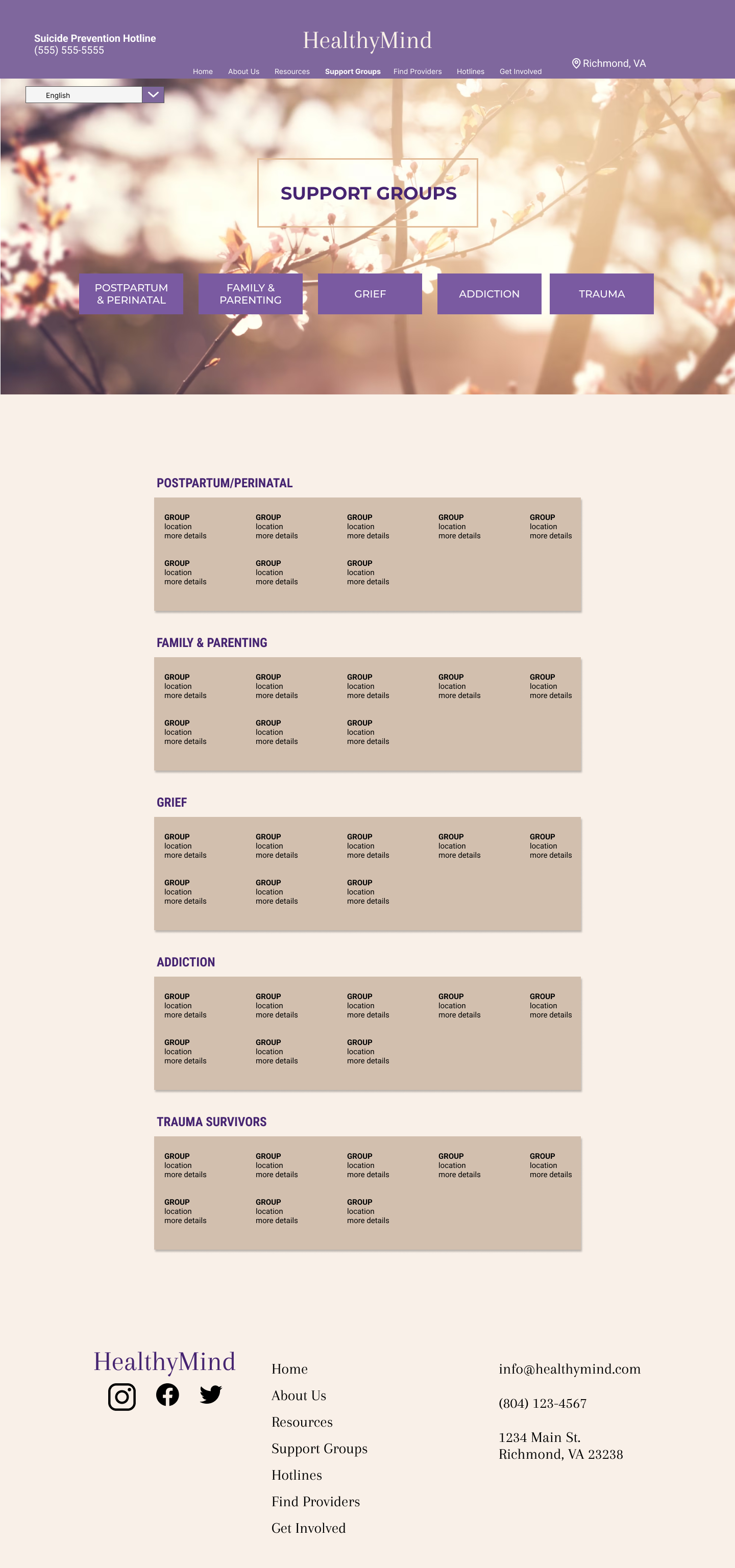
DESKTOP HIGH-FIDELITY PROTOTYPE
MOBILE MOCKUPS
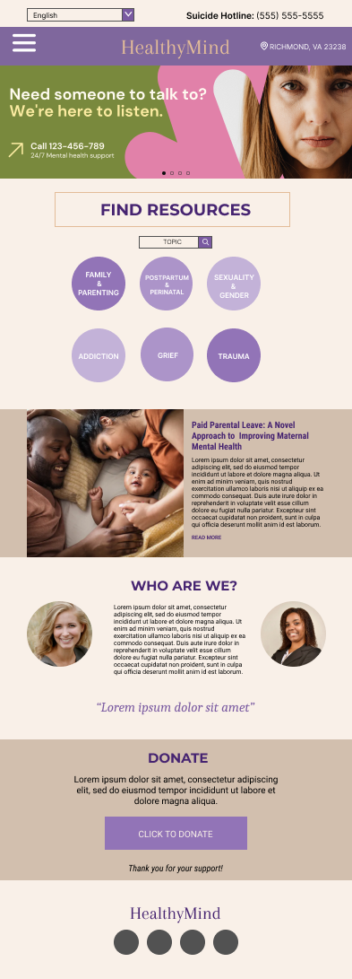
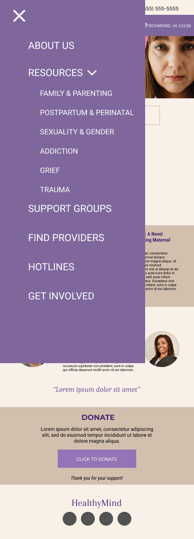

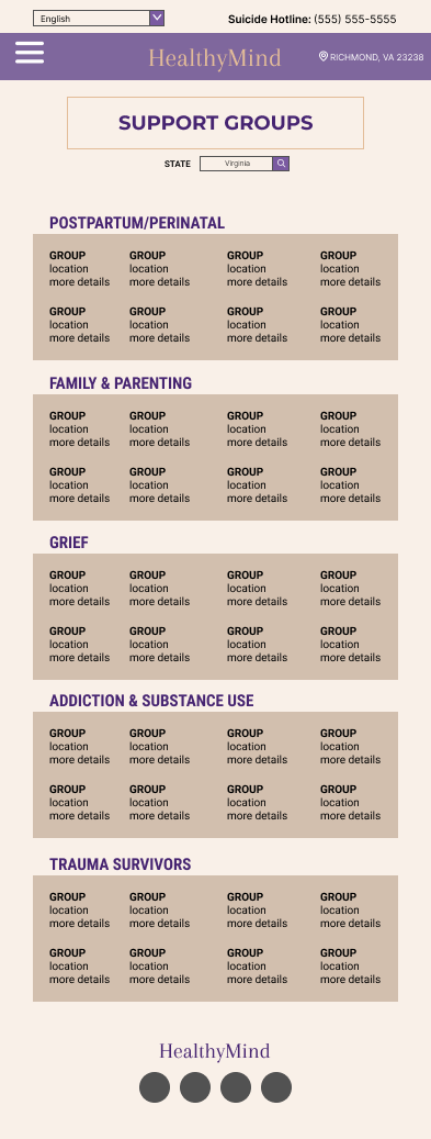
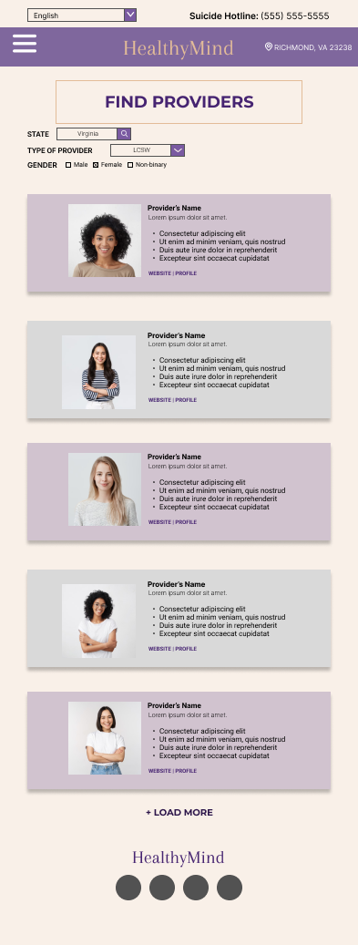
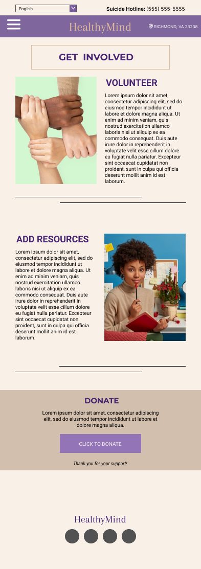
MOBILE HIGH-FIDELITY PROTOTYPE
ACCESSIBILITY CONSIDERATIONS
Impact:
In a final test with users, they felt the design was a better flow and gave way to look for resources without a distracting design. They are able to find the information and utilize it in their own lives to improve their mental health.
“I found the support group I’ve been looking for and a great provider to guide me through my journey!”
What I learned:
Throughout the project I learned that designing for web and app can have very different parameters. In the mobile versions, you want to utilize a lot of the space. In the web versions, you can be a little more flexible with the designs.
